Rashmeet Kaur
UX UI Designer
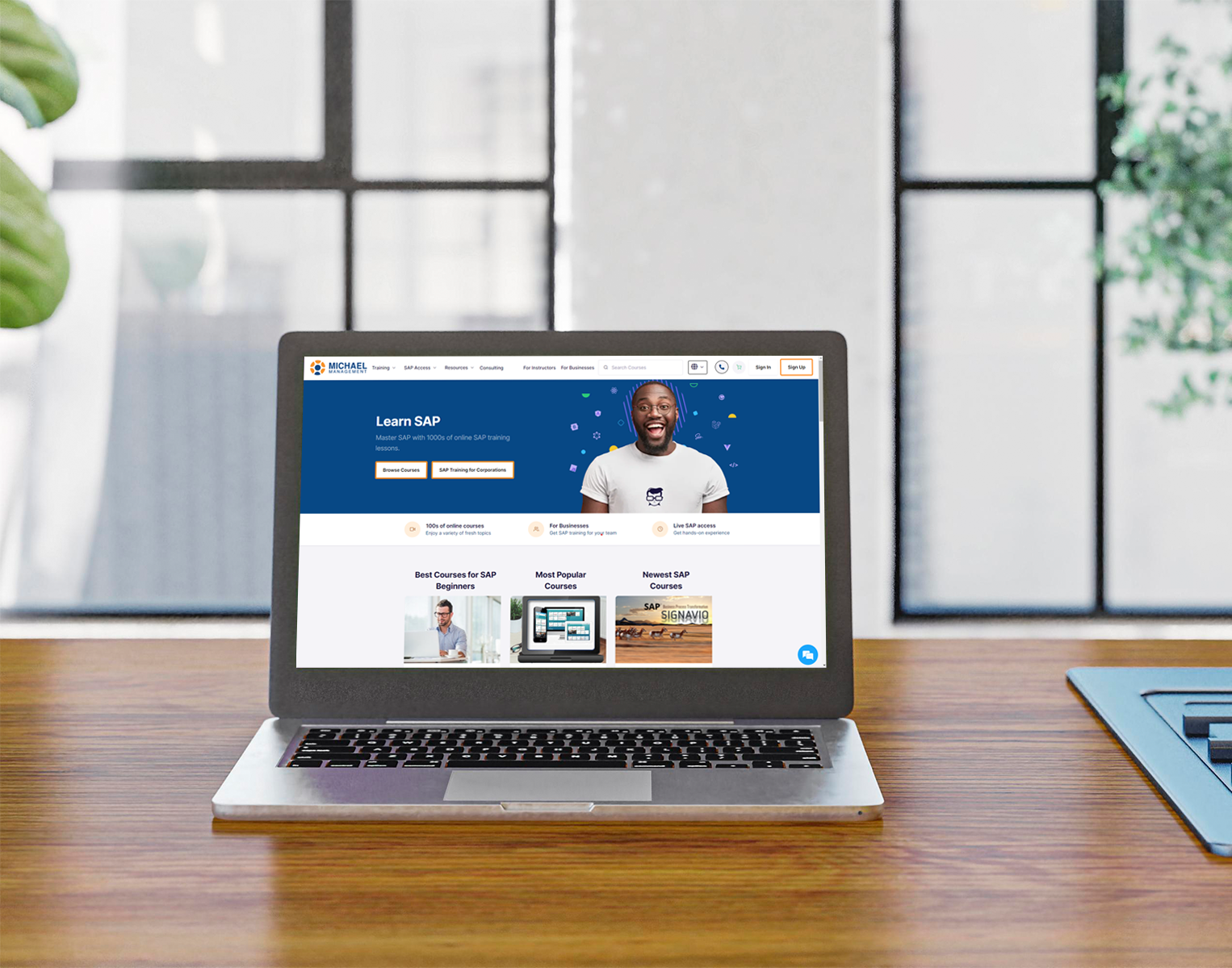
This project's primary objective is to provide a platform that offers an improved online learning experience for SAP. In addition to offering instruction, the website grants users access to SAP sandbox systems so they can put what they've learned in the classroom into reality.
I have always found inspiration in the design teams employed by different online learning platform companies. Additionally, I frequently use online learning environments myself.
In April of 2019, I began working as a UX-UI designer for The Essor IT Solutions team on this project. Being an instructional website, the content on this Michael Management website needed to be distinct and easy for students to understand.

The website's excessive textual content, which made it difficult for a new user to find courses, was the main issue with Michael Management. In addition, the website's navigation is unclear and has a lot of repetitive content, leaving users perplexed about how to purchase the course, where to proceed, and other issues.
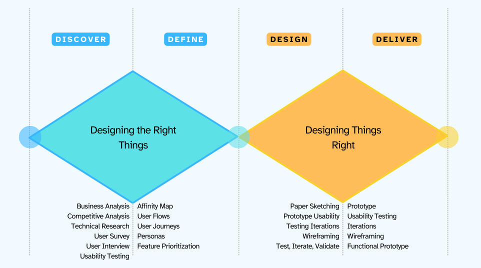
The main challenge was to minimize the amount of clutter on the website and make navigation as seamless and easy for the user by rearranging and reducing content. Also, we have to constantly check the copywriting policies. For redesigning the website, we all decided to apply Double Diamond process to make the whole process of user interface easy, clean and user friendly to use.
Through speaking with our client and browsing the website, we came up with the hypothesis that the course packages were not easily understandable by the students to buy and being lost in during navigation.
We started off our research efforts with domain research in order to get an idea of what the marketplace is like and some inspiration on how educational sites are usually designed.
The following sites were examined during competitive research analysis:
Udemy, SAP, openSAP, Coorpacademy

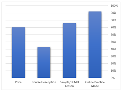
We started doing survey to know what mostly people think about online eLearning. One important question we asked was:
“What are all the factors you consider when looking for an online platform?”
We understood that course description is mandatory for the users, otherwise they have to jump all over the pages to search what content is contained under which topic.
Not only is there a course overview on the course being opened, but there is also an Exam/Certificate section, and also for whom this course is available, lesson plan and student’s feedback.
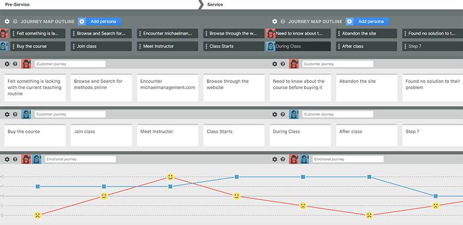
To help us visualize the pleasure and pain points of a typical user’s journey, we created 2 User Journey maps to illustrate it. The red one illustrates the highs of a user encountering the michaelmanagement website and browsing with anticipation of possible educational benefits. However, that high is short lived as navigation frustration takes over. The second one that is the blue one is basically describing the experience of a student inside a michaelmanagement class.
With so much research information available to us, it was important for us to gather our thoughts and categorize them in order to draw design related implications from it. Affinity Diagram actually helps in organizing:
1. Observations or ideas from a research study
2. Ideas that surface in design-ideation meetings
3. Ideas about UX strategy and vision
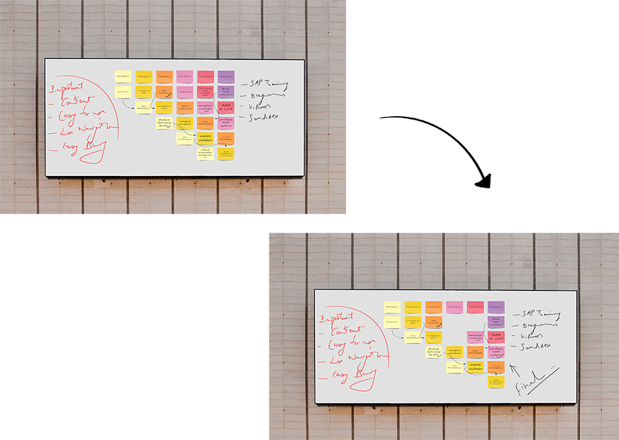
With so much redundant information available on the website, we wanted to rearrange and condense this into a content which is usable for the user and they directly get what they want. Therefore, working on the Information Architecture was one of the most important things we did for our project. First we conducted a Content Audit to analyse the current structure of the website. We checked every single page and section of the website, wrote a brief description of it, and also documented any outgoing links. At the end of the exercise, by looking at duplicate outgoing links and similar descriptions, we were able to identify pages and sections that we deemed as redundant.
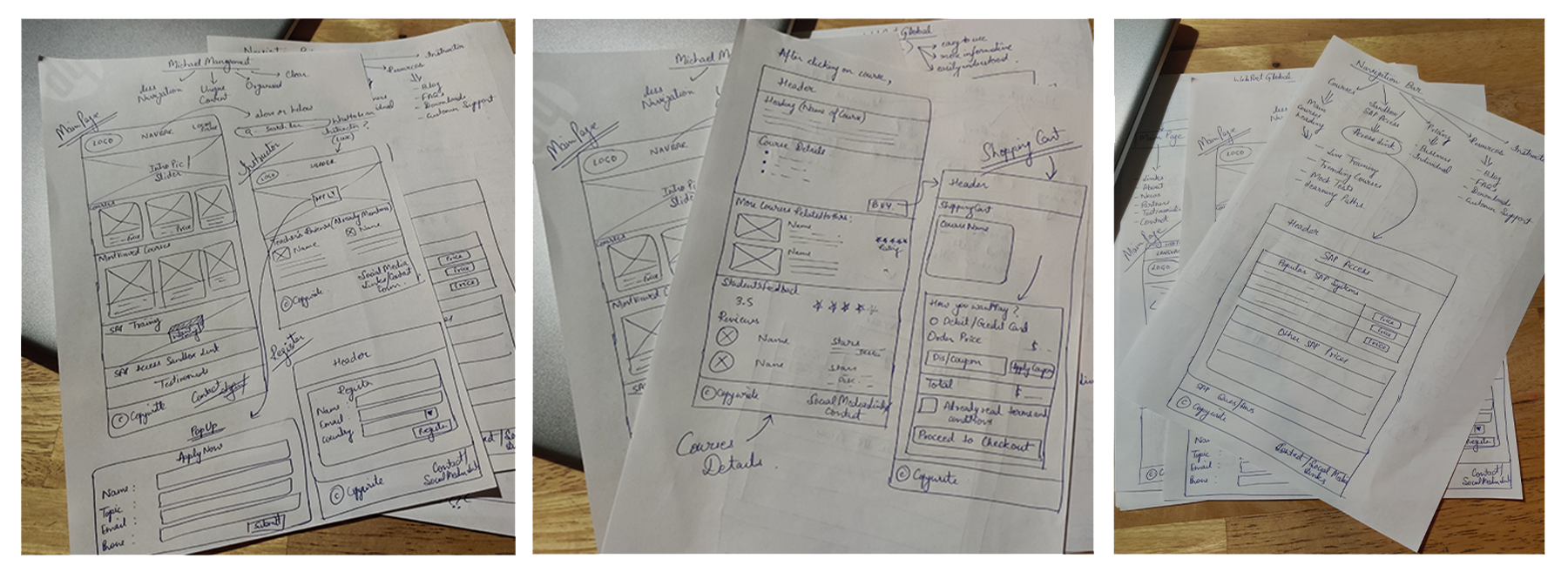
With so many ideas flying around it was challenging for us to decide what an ideal design should be, therefore we started our design phase. For this, all designers designed low and mid fidelity wireframes for the page and then we discussed what we liked or disliked and then agreed on the ideal design.
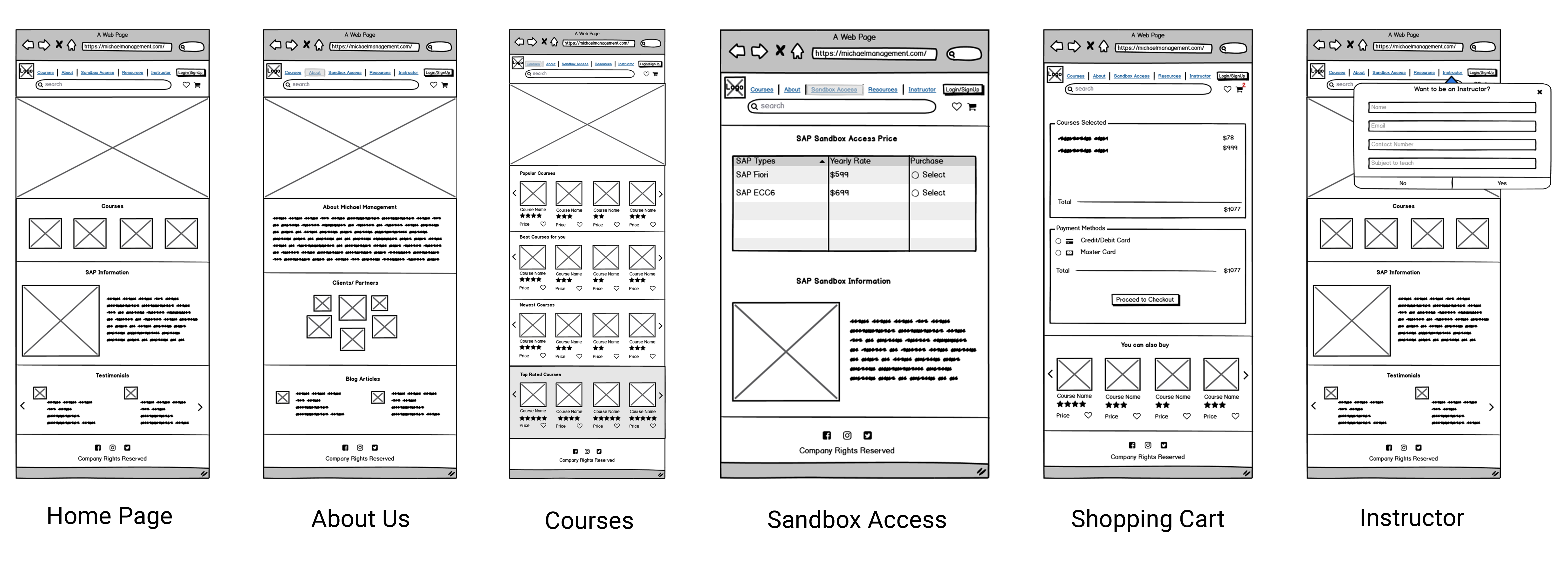
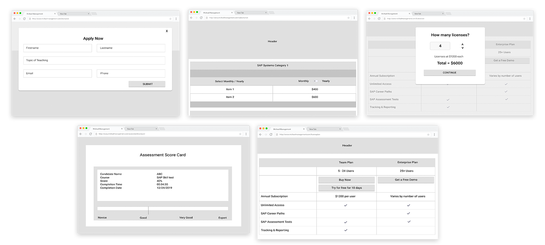
It was definitely a great experience, and our client was over the moon with the final product and said it was everything they envisioned. We realized that although we did a great job of rearranging and condensing content, there is still much room for improvement when it comes to the actual written material presented. Therefore, we suggested to our client that they should consider hiring professional copy writers to help them as it would be outside our project scope.
